Production Overview
Project Vision
To transform the current production schedule feature into a comprehensive module as Production Overview which supports increase in production through efficient monitoring systems, offering real-time insights to optimize operations and maximize productivity.
This started as a calendar redesign. As research surfaced more gaps (no real-time status, numbers with no trend context), the scope grew with them, into the three-part module below.

Existing Feature Study
Examined the current features to understand their functionality and pinpoint any gaps or opportunities for innovation and monitoring real-time changes and customer requests.
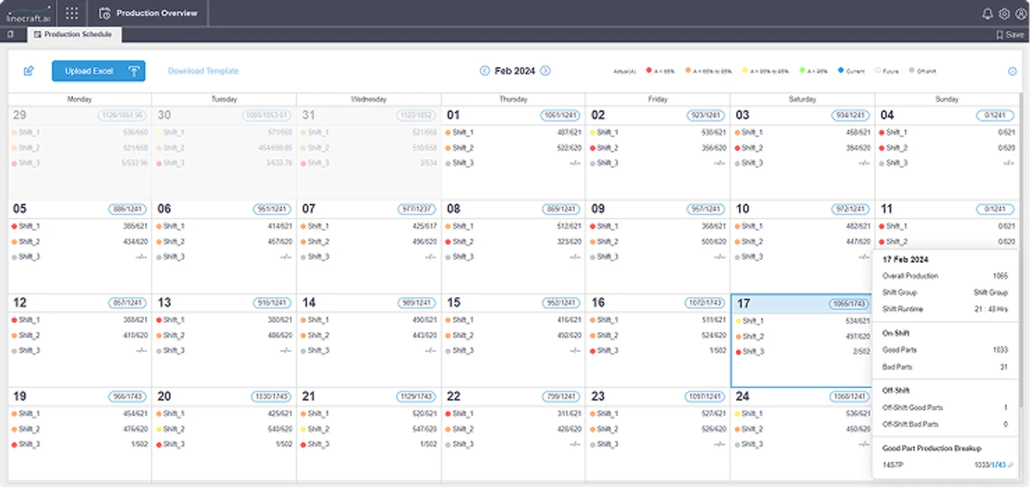
What is the Existing Feature?
- Primarily functions as a calendar view, providing details on production.
- Offers production breakdowns by shifts and part type upon hovering
- Facilitates modification for shifts and targets for a specified duration.
Where Does it Fall Short?
- Doesn't support real-time monitoring during shifts, lacking insightful shift & day analysis.
- Absence of upfront data on production breakdown by quality and part type.
- External referencing for graphs needed for comprehensive insights.
- Simplistic modification process lacking enriched flow.
- Inability to visualize and identify patterns within shared data in the existing module, essential for analysis.
- Absence of data on the reasons behind modifications and the responsible person.
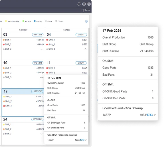
What changed
Before, knowing production status meant walking to the board or waiting on a delayed dashboard. Now it's live: supervisors can see a shift's output as it happens and act mid-shift instead of finding out after.
The gap was real, and closing it mattered most in the window where the information could still change the day.
Secondary Research Insights
- Manufacturing Blogs, Whitepapers and Articles
- Literature Review
- Competitive Analysis
- Manufacturing Documentation
- Despite potential information overload, users prefer rich interfaces with helpful features for informed decision-making. Enhanced visualization reduces cognitive load and empowers efficient process management. Strong visual cues, immediate accessibility of data, tooltips, context menus, and a flat information hierarchy contribute to a better user experience.
- Integration of IIoT in manufacturing boosts smarter, more efficient production as real-time tracking and monitoring enhance resource efficiency, reduce costs, and increase competitiveness.
- Performance evaluation frameworks improve visibility and decision-making at all enterprise levels. Data analytics and machine learning applied to IIoT data optimize processes and enable predictive analytics for operational excellence.
- A comprehensive strategy is necessary to address scalability, user adaptation, integration barriers, data quality, security, and customization to fully leverage emerging technologies. These support operational capabilities and sustainable development goals, enhancing transparency and customer satisfaction.

Competitive Analysis
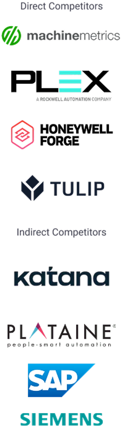
- Real-time updates and visibility on the production floor are standard features, ensuring responsiveness.
- Increasing adoption of AI-driven insights and advanced analytics for deeper insights into production & identifying improvement for operational efficiency.
- Improved user interfaces and role-based control features are becoming standard to ensure systems are tailored to different roles.
- Seamless integration with ERP systems is a key strength, particularly for SAP products, enabling smooth data flow and comprehensive enterprise management.
- Incorporating features that help monitor and reduce environmental impact is becoming increasingly important.
- Most solutions offer advanced production planning and scheduling tools, with features like automated scheduling and resource allocation.
Primary Research
- Interviews
- Shadowing
- Contextual Inquiry
- Questionnaires
- Sample Size
- 20
- Duration
- 60 Mins
Potential Users and Stakeholders
Potential Users and Primary Stakeholders
- Production Supervisors
- Production Manager
- Production Planner
- Plant Head
Other Potential Stakeholders
- Quality Supervisors
- Quality Manager
- Maintenance Supervisors
- Maintenance Manager
Subject Matter Experts
Subject Matter Experts
- Configuration Team
- Product & Design Team
- Marketing Team
- Engineering Team
- Sales Team
- Customer Success Team
Manufacturing Line Visits
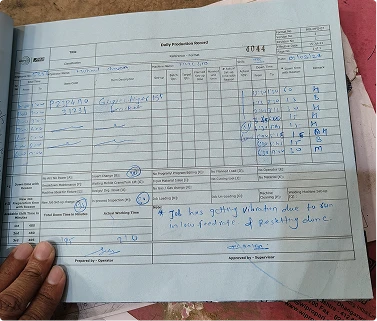
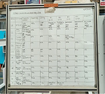
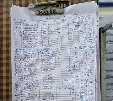
Insights on Production Artefacts
Mapping the Insights
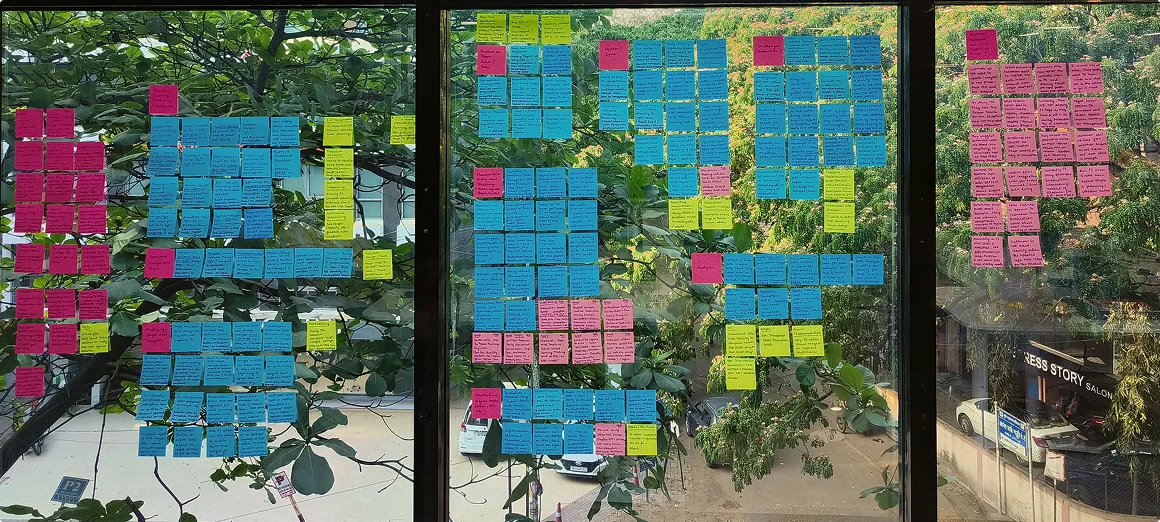
- Roles and Responsibilities/Operations
- Insights
- Customer Inputs
- Potential Direction for Solution
Major Insights and Observations
The current data entry methods utilized are manual, with only a few digital outputs rarely monitored throughout the production process.
There is a noticeable delay in identifying the root cause of production issues, followed by further delays in their long term resolution.
Essential data for understanding line performance is fragmented across the shop floor, causing significant time delays in gathering comprehensive insights.
Recurring factors contribute to production issues, sometimes remaining undetected in terms of their full impact, leading to persistent challenges.
Data collected on the shop floor often fails to provide actionable insights, highlighting a lack of guidance in addressing deviations, hindering problem-solving.
There exists a lengthy chain of communication to relay information to higher management, leading to potential delays in addressing critical issues.
and why do production issues arise?
Method
Inefficient sequencing of assets and subpar man-machine coordination lead to inefficiencies and delays in production.
Machine
Equipment breakdowns and operational inefficiencies often disrupt production and result in escalated maintenance costs.
Man
Inadequate training and the burden of overworked labor significantly reduce productivity and increase errors.
Material
Shortages, late deliveries and inconsistent incoming quality stall the line and force rework, driving up scrap and cost.
Delays in Manufacturing Process Flow

Sorting Identified Problems
| Priority | Problems | Stakeholders |
|---|---|---|
| High Priority | Scattered tracking of data affecting production, hence unable to identify the production issues in one glance | Production SupervisorManager / Plant Head |
| Recurring factors lead to production issues, which can often go undetected in terms of impact. | Production SupervisorManager / Plant Head | |
| Lack of attribution for missed targets and reasons for modifying production schedules, shifts, targets, and timings which is crucial to identify recurring issues. | Production PlannerProduction SupervisorManager / Plant Head | |
| The data collected on the shop floor does not provide actionable insights, and there is a lack of guidance on addressing deviations or missed targets. | Production PlannerProduction SupervisorManager / Plant Head | |
| Medium Priority | Sole reliance on manual shop floor data and andon systems for tracking production progress. | Production SupervisorManager / Plant Head |
| Updating all levels and departments with various priority information is time-consuming. | Production PlannerProduction SupervisorManager / Plant HeadVPs | |
| Absence of ERP integration for resource allocation. | Production Planner | |
| Difficulty in identifying the most efficient way to modify schedules due to unforeseen issues | Production SupervisorManager / Plant Head | |
| Low Priority | The production plan lacks clear visibility across all levels, requiring multiple printing and sharing. | Production PlannerProduction SupervisorManager / Plant HeadVPs |
| Tracking operator performance after assigning task is a tedious process. | Production Supervisor |
Key Problems in Flow
1. Tedious Manual Data Entry
Labor-intensive process of inputting data manually, often prone to errors and inefficiencies.
2. Fragmented Data Collection
Data scattered across multiple places, affects timely comprehensive analysis for decision-making.
3. Lack of Actionable Insights
Data collected fails to provide meaningful or useful information for guiding decisions or addressing issues effectively.
4. Delayed Root Cause Identification
Extended process of pinpointing underlying reasons of issues, resulting in prolonged resolution times & operational disruptions.
5. Recurring Factors Causing Issues
Identifying persistent elements or circumstances contributing to ongoing problems or challenges in operations.
6. Lengthy Communication Chain
Communication process involving multiple steps or intermediaries, resulting in delays and potential misinterpretations.
Refined Problem Statement
Identifying and promptly resolving production issues is time-consuming, primarily due to inefficient processes in gathering and analyzing shop floor data alongside ineffective communication among teams. The fragmented nature of production data limits comprehensive insight generation which is necessary for effective decision-making.
Target User Personas
The Production Supervisor and Manager represent frontline and strategic management. Addressing their needs and frustrations would streamline processes, improve communication, and enhance decision-making, boosting efficiency and productivity in the manufacturing plant.
Production Supervisor
Vikram
Vikram runs the floor shift to shift. The numbers he needs are scattered across shop-floor sheets and andon boards with no single place to check them — and per the prioritised problem table, that gap is his and his manager's alone to absorb. Even once he tracks a number down, nothing tells him what to do about it.
I can see the numbers are down. What I can't see is why, and by the time I've pieced it together, the shift's already over.
Production Manager
Meera
Meera coordinates across departments and reports up to plant leadership. Recurring issues go undetected in their full impact until they've already cost several shifts, and relaying priority information through every level is, on its own, time-consuming enough to eat into the time she needs for actual decisions.
The same issue quietly costs us every week and nobody's connected the dots, and by the time it reaches me, it's already old news.
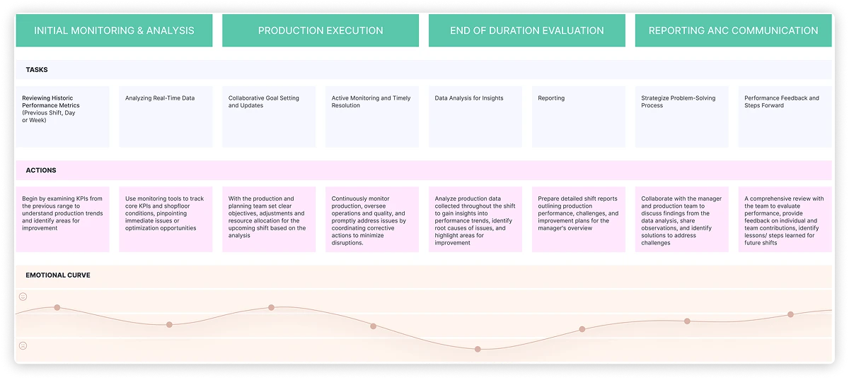
User Journey
Design Intervention
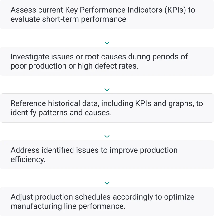
Ideal Production Monitoring & Analysis Process
Understanding the optimal flow for production monitoring and analysis process and then breaking it down into specific steps.
Design Direction
- Highlight crucial Key Performance Indicators (KPIs) and relevant graphs upfront, such as those categorized by part type and machines, to facilitate decision-making.
- Allow to perform a flow for analysis till asset level data as per the problem solving required.
- Provide insights with analysis, with subsequent expansion on strategies to address production issues, including recommendations eventually.
- Enhance the flow of modification information, also detailing when the modifications occurred, what was modified, why they were made, and by whom they were made
Initial Concepts
Gamification of Production Monitoring
- Concept
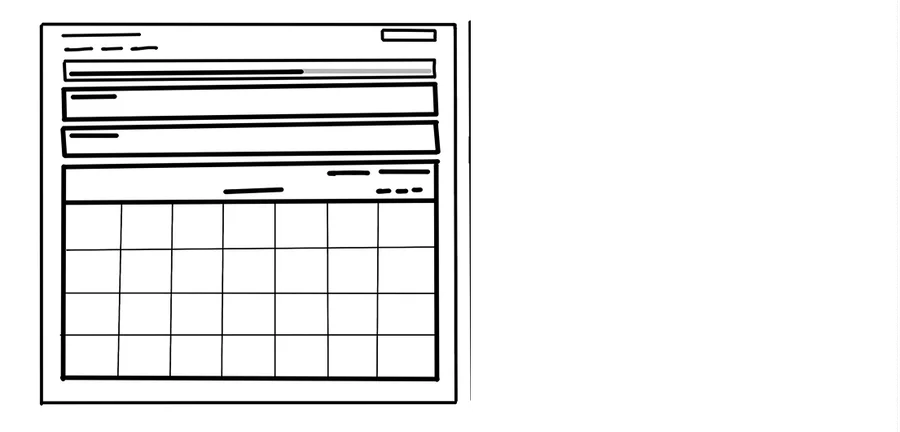
- Design a gamified interface for production monitoring, where employees can track their individual and team performance in real-time.
- How it works
- The interface employs visual cues, such as progress bars, badges, and leaderboards, to provide instant feedback on production targets and achievements. Additionally, interactive challenges and rewards can be incorporated to incentivize productivity and foster friendly competition among teams.
- Benefits
- Enhances user engagement and motivation, promotes a sense of accomplishment among employees, and encourages continuous improvement through positive reinforcement.
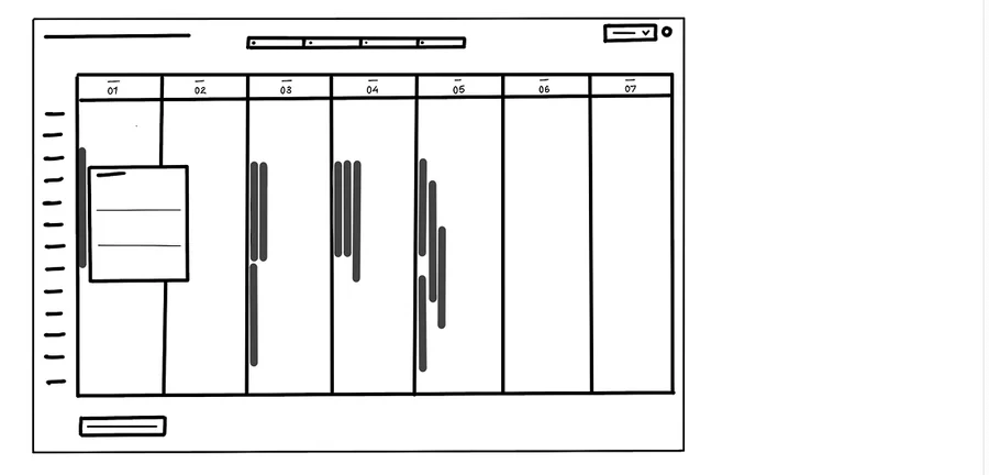
Drag and Drop Bars for Scheduling
- Concept
- Transforming production scheduling into an interactive experience akin to adjusting bars in video editing software or block coding.
- How it works
- Users manipulate bars representing tasks or events by dragging or resizing them, allowing dynamic adjustments to the schedule.
- Benefits
- Provides a visual representation of the production schedule, simplifies manipulation through familiar interactions, fosters engagement through interactivity, streamlines decision-making by offering real-time adjustments, reduces the learning curve through intuitive controls, and enhances productivity by enabling quick modifications.
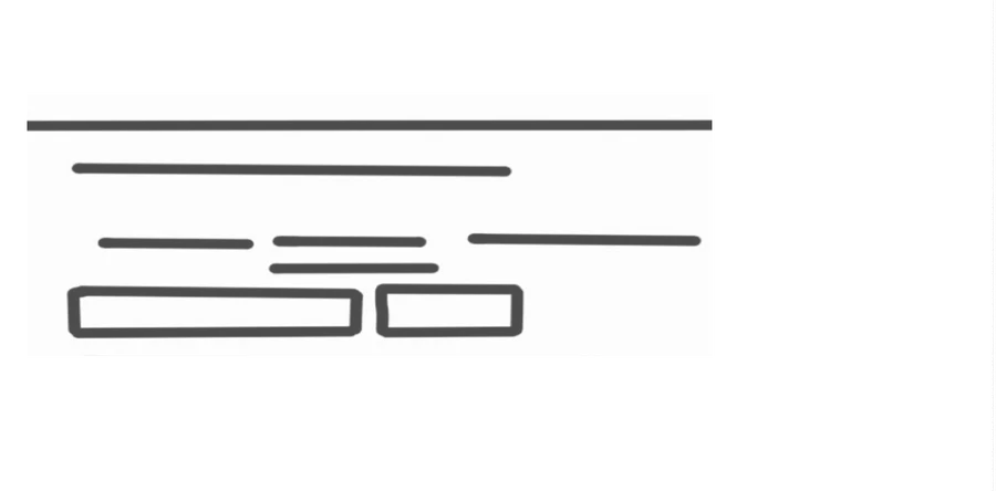
Voice-Activated Production Assistance with AR
- Concept
- Combine AR-based guidance with voice-activated assistants to offer real-time support. AR overlays contextual info on equipment, while voice commands access data, troubleshooting guides.
- How it works
- Employees can interact with the system using natural language to access production data, retrieve troubleshooting info, or report issues. It provides instant responses and recommendations, enabling faster decision-making and problem resolution.
- Benefits
- Enhances accessibility and usability for employees, reduces cognitive load and task complexity, improves response times to production issues, and supports hands-free operation.
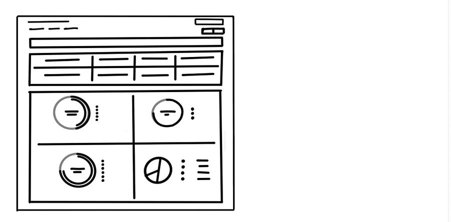
Personalized Production Insights Dashboard
- Concept
- Design a personalized production insights dashboard that tailors content and visualizations based on individual user roles and preferences.
- How it works
- Employees can customize their dashboard layout, select relevant KPIs and metrics, and set up alerts for key events or thresholds. The dashboard provides actionable insights and recommendations tailored to each user's specific needs, improving decision-making and productivity.
- Benefits
- Increases user engagement and adoption of the dashboard, improves relevance and usability of production data, facilitates targeted problem-solving and decision-making.
Focus Groups
- Participants
- 5 Novice and 5 Expert
- Duration
- 20 – 30 mins
Key Insights and Recommendations
- Incorporate interactive graphs and charts for better understanding of production data along with KPIs. Provide real-time production and operation condition status.
- Simplify the menu structure for clearer pathways to key features, enhancing navigation and intuitiveness.
- Enable modifications based on shifts to comprehend the total production or the different part types being manufactured.
- Include multiple shopfloor edge cases for considering the modification flow.
- Only knowing the production numbers is not important, the context which led to these low numbers is of greater significance.
- Allow personalization of dashboards or prioritization of information according to the roles.
Guerrilla Testing
- Duration
- 30 – 40 mins
Key Insights and Recommendations
- The dashboard data lacks clarity regarding the timeframe it represents, such as whether it pertains to a specific shift, an entire day, or some other period, as no information is provided.
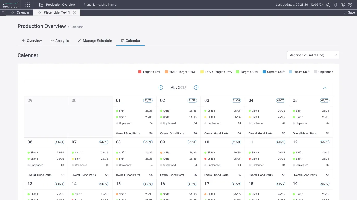
- The calendar view in schedules is overloaded with information, causing cognitive overload. Accessing the same data through charts in analysis by selecting a date range is more efficient.
- All the data is there, but it requires considerable time and effort to interpret. Understanding entails a lot of reading and exploration on the screen.
- Users find it challenging to navigate through the some parts of the interface due to lack of hierarchy in information, leading to difficulties in locating specific information or features.
- There is no clear indication of when the data was updated last.
- The abundance of graphs overwhelms with data, especially when viewing multiple graphs simultaneously, making it easy to lose context.
Proposed Design Solution

Production Overview is divided into three parts: Overview, Analysis, and Modify.
Overview
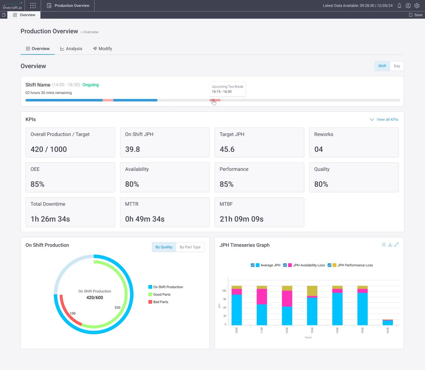
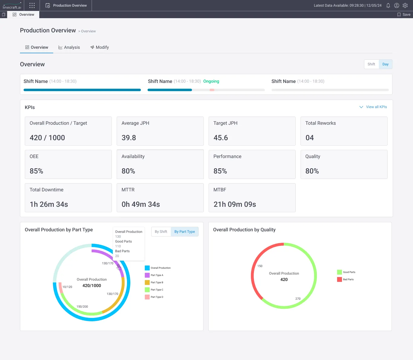
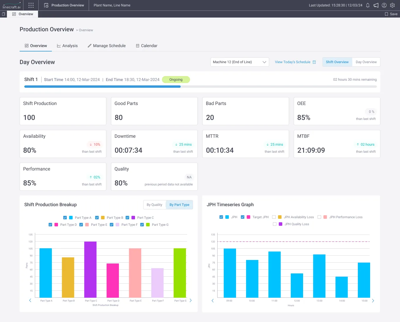
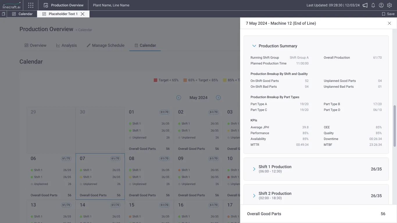
The Overview Tab includes the Shift View, which is the default, and Day view. It also features Shift and Day Progress Bars, Important KPIs, and a JPH Graph to visualize trends. The Overall Production Visualization provides insights into shift-wise, quality-wise, and part-type-wise production.
Analysis
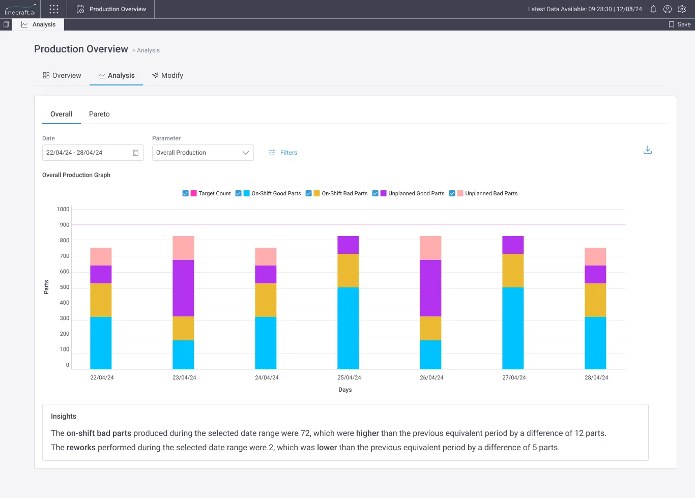
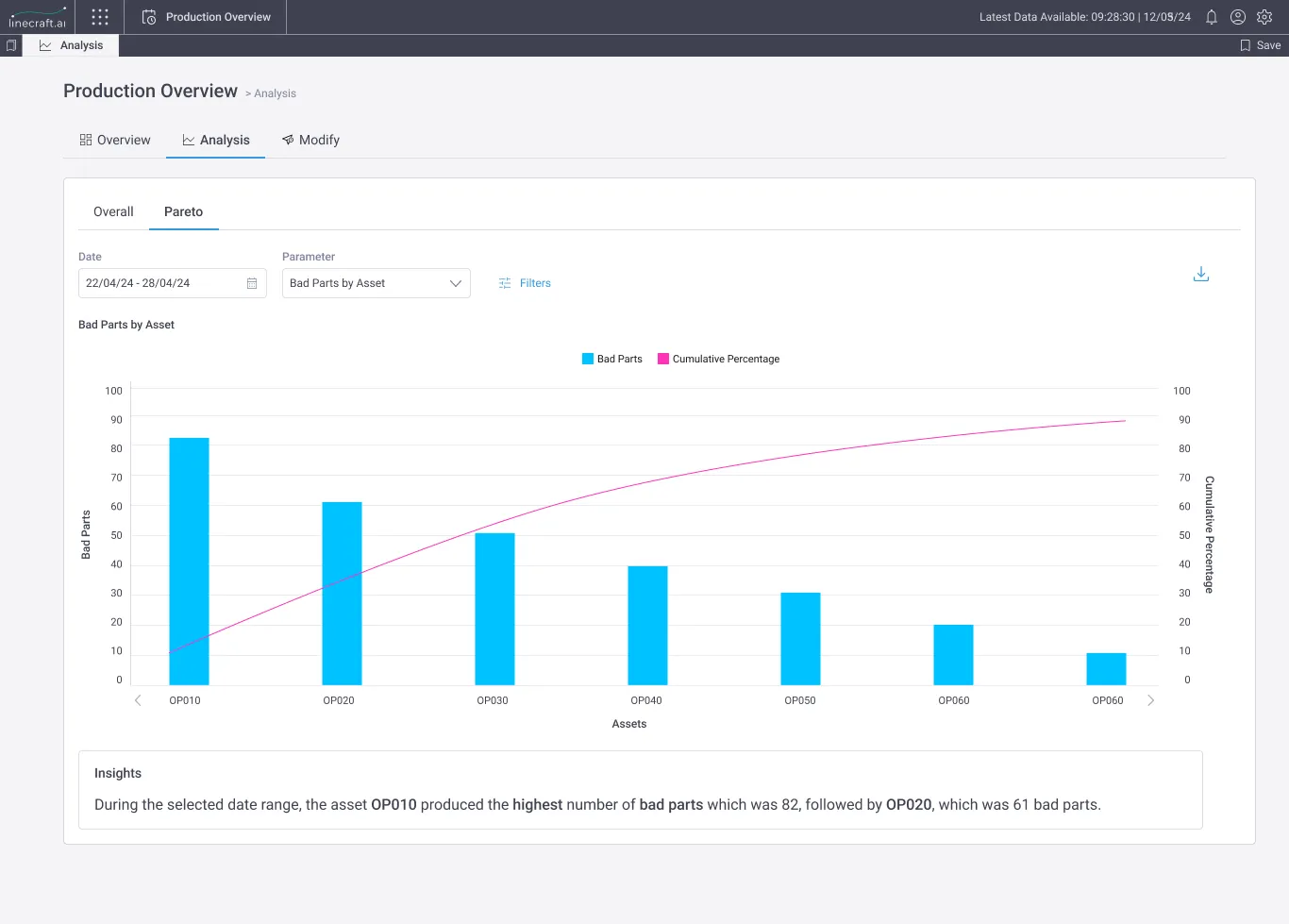
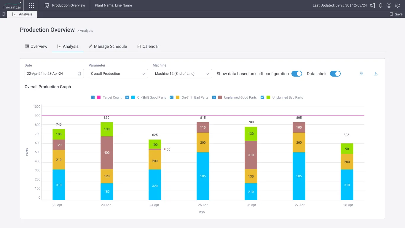
In Analysis, there are two main sections: overall graph and Pareto. Here, one can set a date range and analyze the data by selecting parameters to focus on and applying filters such as shift, part type, and assets. This allows users to drill down to see performance over time, ranging from a 7-day to an asset level.
Modify
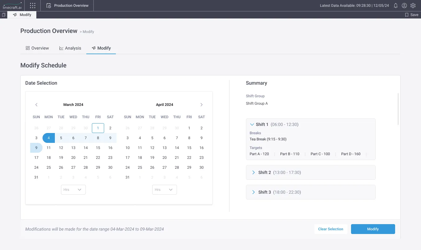
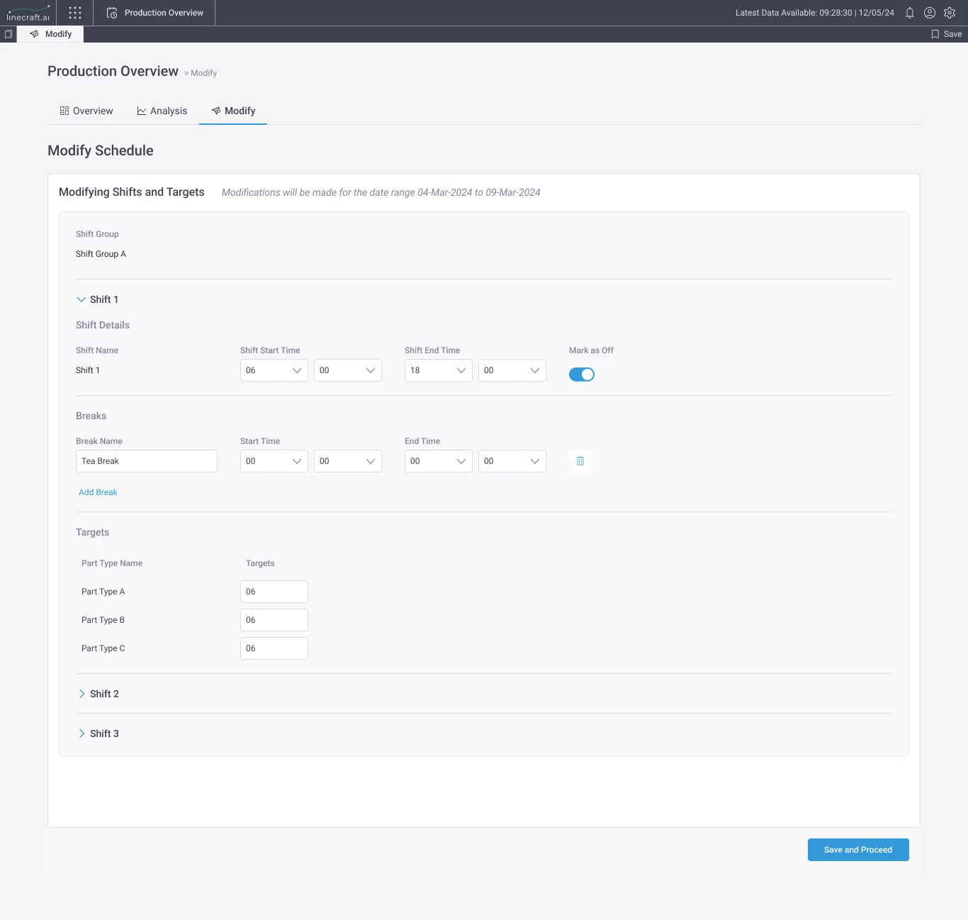
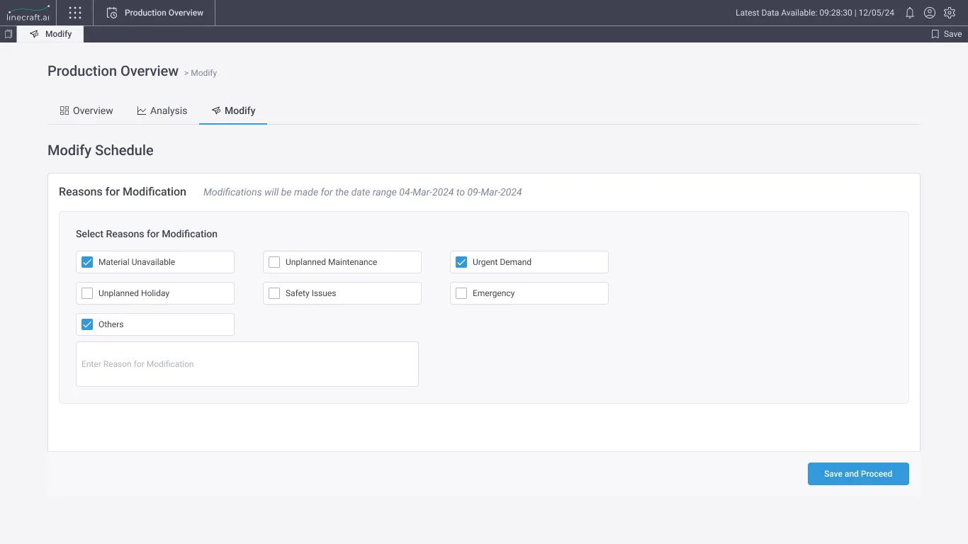
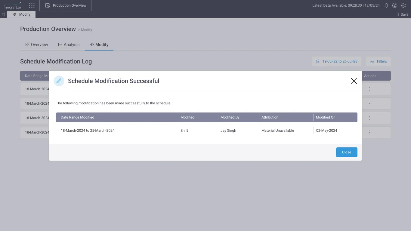
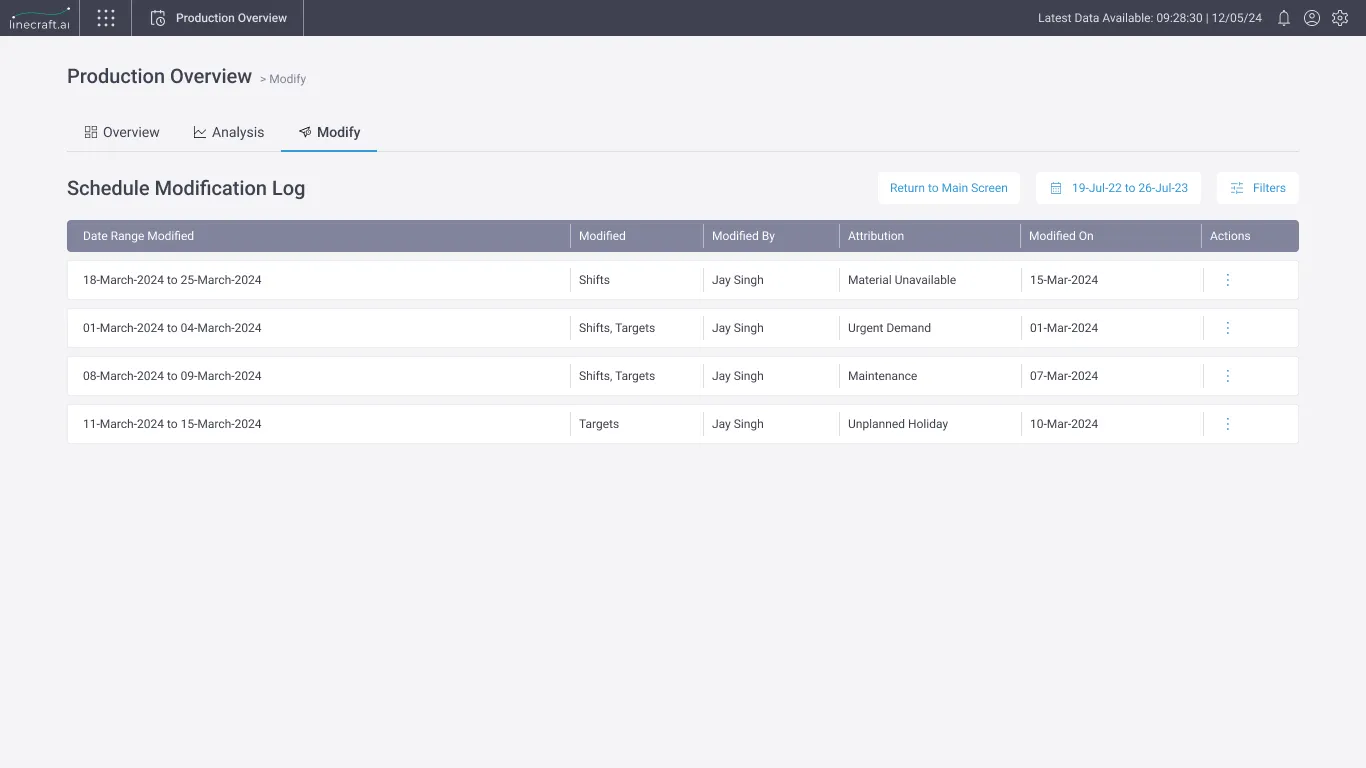
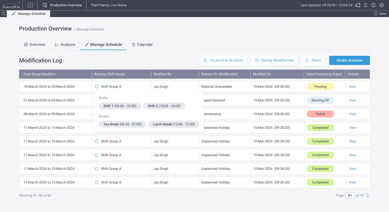
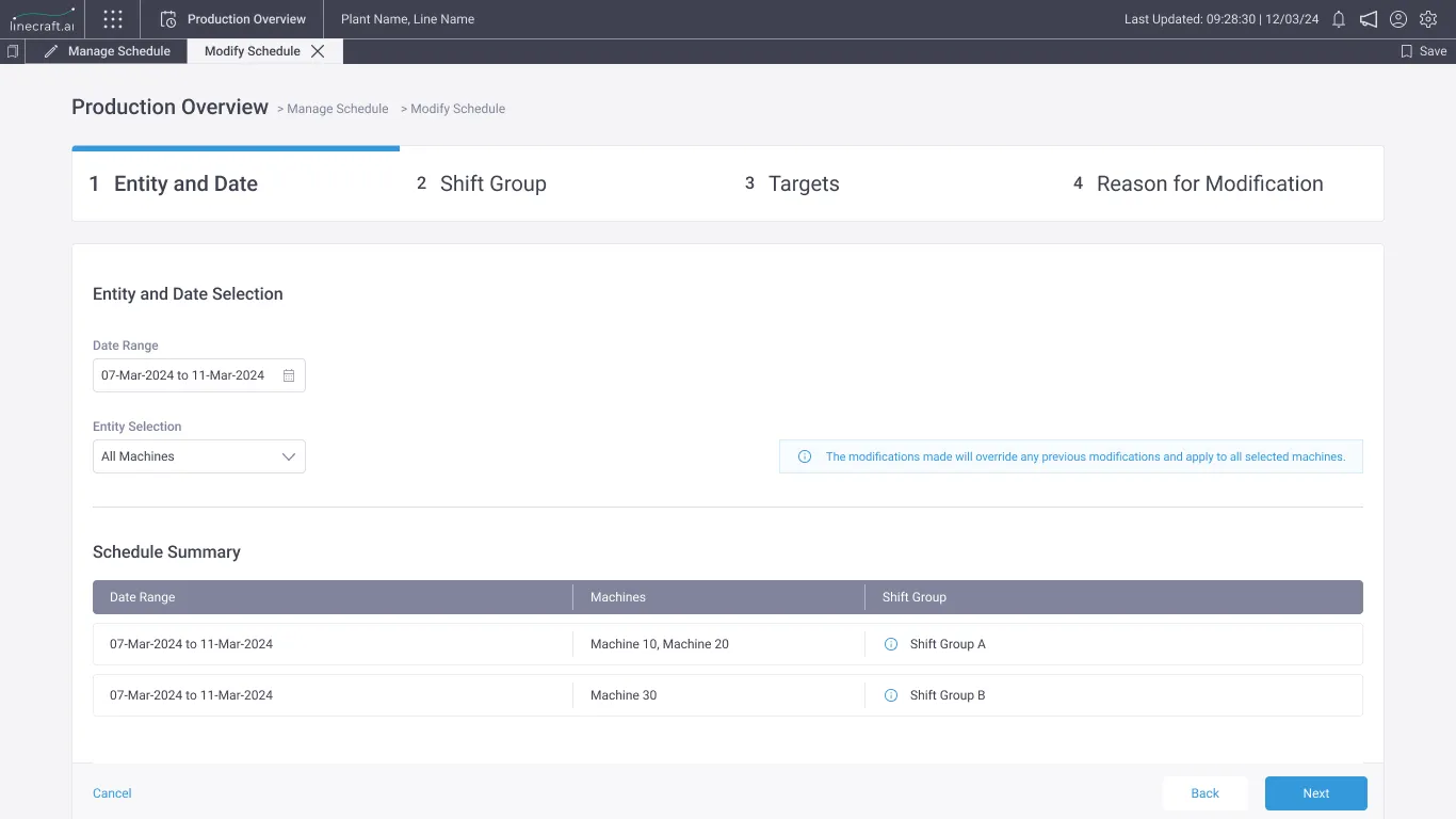
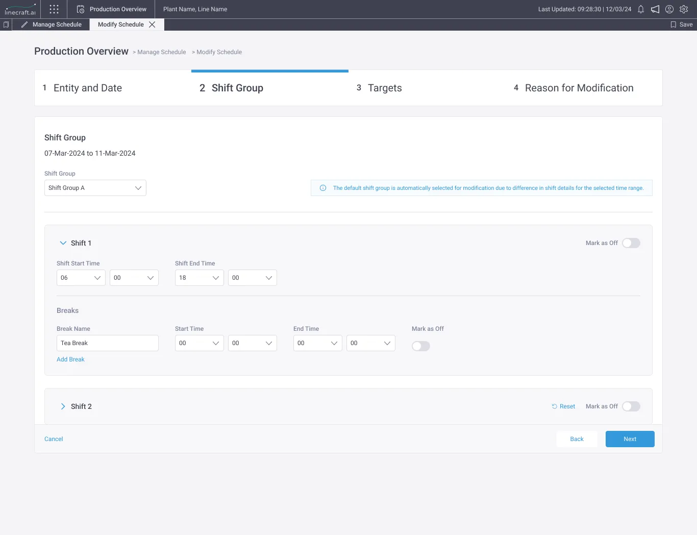
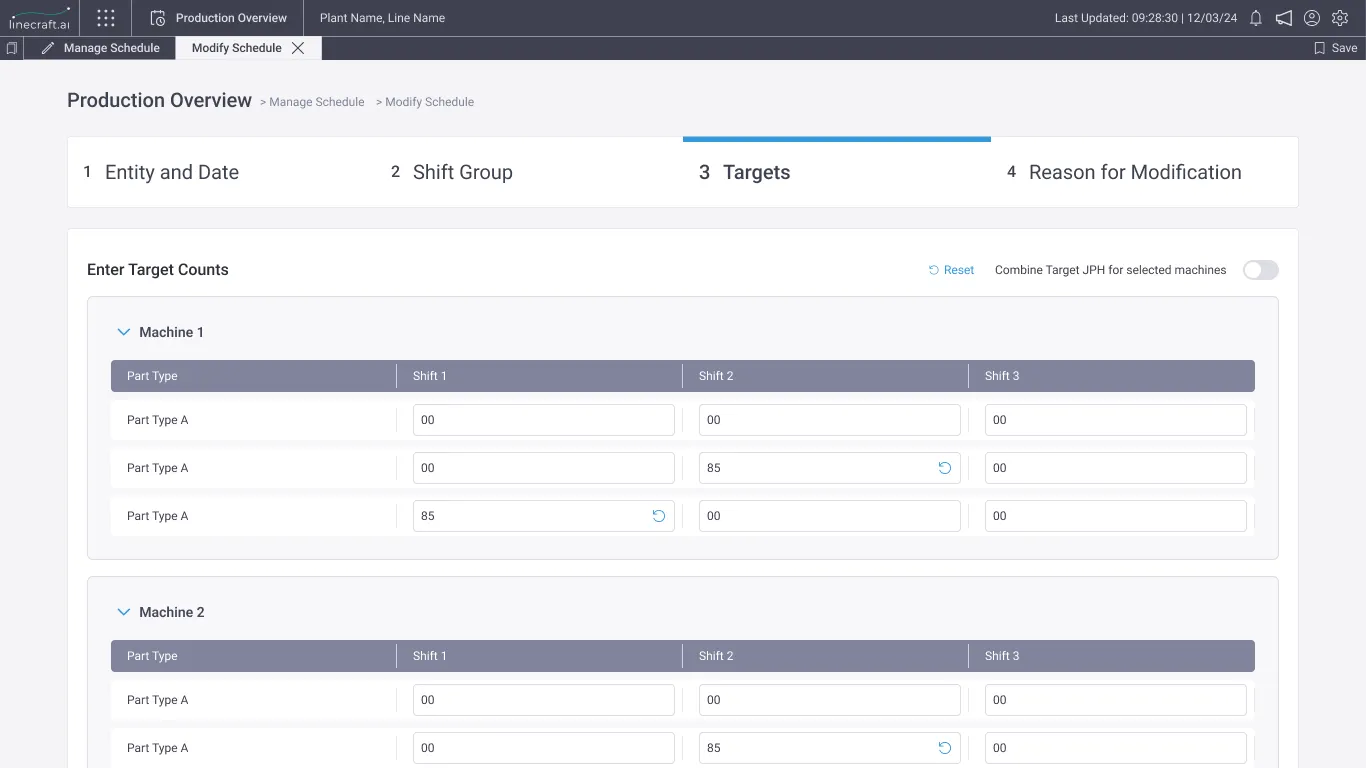
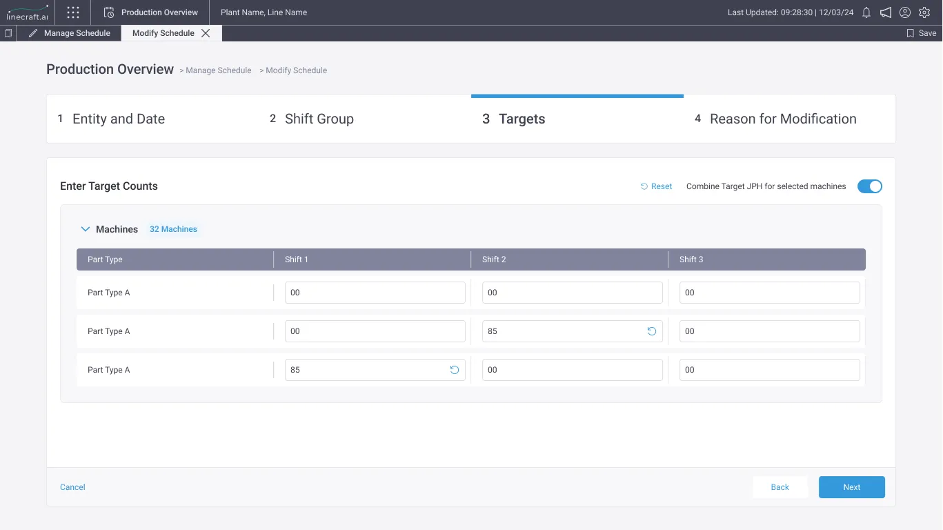
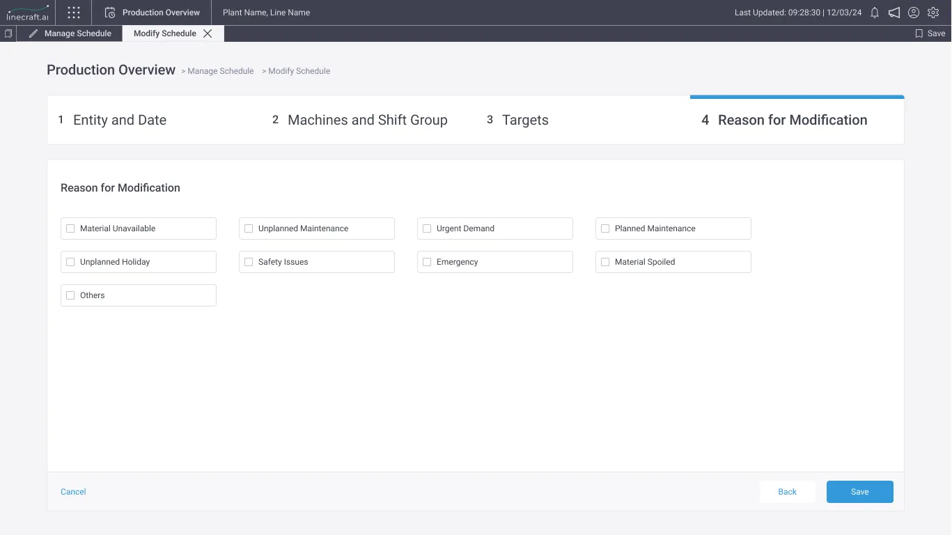
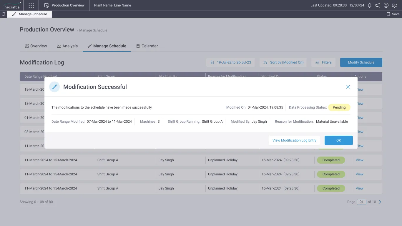
In Modify, users can select a date range and adjust shift details — timings, breaks, and mark as off, along with modifying shift targets based on part types. Users can also attribute the reason for modification, and maintain a modification log, adding context behind any modification.
Information Architecture
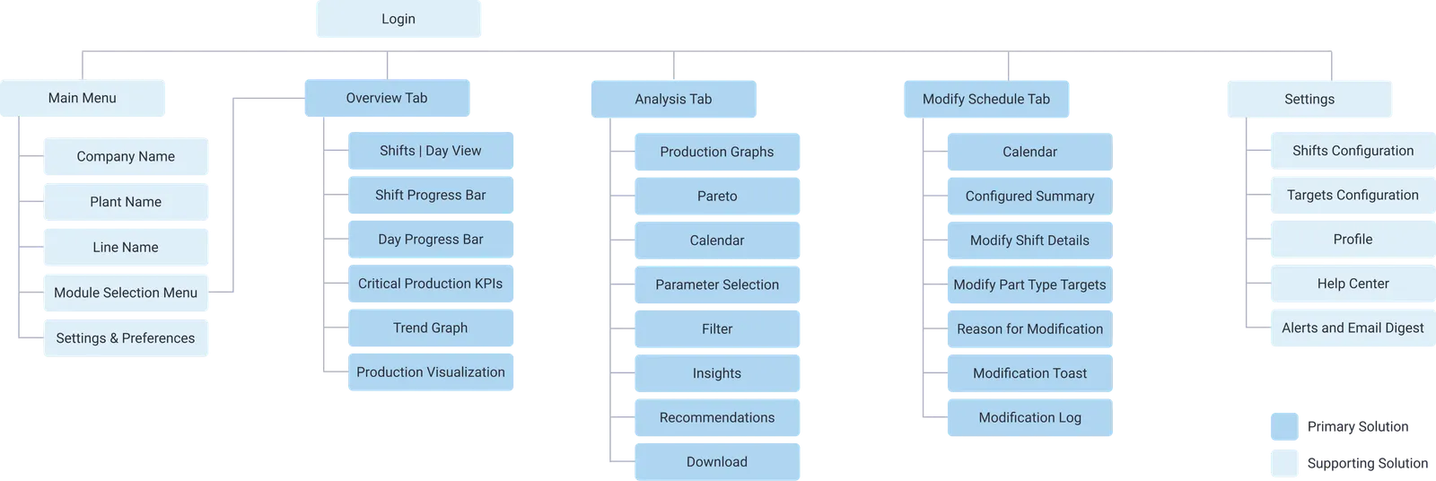
Overview Tab
The Overview Tab includes the Shift View, which is the default, and Day view. It also features Shift and Day Progress Bars, Important KPIs, and a JPH Graph to visualize trends. The Overall Production Visualization provides insights into shift-wise, day-wise quality-wise, and part-type-wise production.
Analysis Tab
Under Analysis Tab, there are two main sub-tabs: Overall and Pareto. Here, one can set a date range and analyze the data by selecting parameters to focus on and applying filters such as shift, part type, and assets. This allows users to drill down to see performance over time, ranging from a 7-day to an asset level.
Modify Tab
In Modify, users can select a date range and adjust shift details — timings, breaks, and mark shift as off, along with modifying shift targets based on part types. Users can also attribute the reason for modification, and maintain a modification log, adding context behind any modification.
Strengths of Solution
- Automates tedious manual data entry processes and streamlines communication chains with shared dashboards.
- Centralizes data collection from fragmented sources into a single platform, streamlines labor-intensive data input tasks.
- Generates actionable insights for decision-making.
- Enables real-time root cause identification, reducing delays.
- Facilitates the identification of persistent elements contributing to operational challenges.
Usability Testing
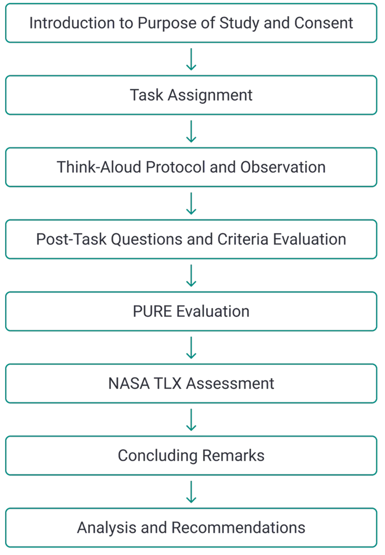
I crafted a screener to select ten participants meeting predefined criteria, which comprised 3+ years of manufacturing experience, specialized training, strong technical skills, advanced problem-solving, and regular interaction with manufacturing software and IIOT devices.
- Participants
- 10
- Duration
- 60 – 120 Mins
Task Assignment
Task 1 — Overview
Check Overall Production and JPH for the Current Shift & Day
As a production supervisor, you need to review the Overall Production, Good Parts and Bad Parts Production and JPH trend for the Current Shift and further review the Overall Production, Good Parts and Bad Parts Production and Average JPH for the Day. Can you locate and interpret this information in the system?
Task 2 — Analysis
Analyze JPH for Part Type A in Shift 1 for the Last 10 Days
As a production supervisor or production manager, you are interested in analyzing the Average JPH of Part Type A during Shift 1 over the past 10 days. Can you navigate to the appropriate section and retrieve this information? Can you identify the Day with lowest JPH and further interpret the major asset contributing to it?
Task 3 — Modify
Modify Shift Timing and Revise Targets for Upcoming Week
As a production supervisor or production planner, you need to adjust the timing for Shift 1, to include an additional 1 hour of runtime for next week. Further, you want to increase the production targets for Part Type A by 30 parts. Can you locate the appropriate section and make the necessary modifications?
Average Rating Analysis — Criteria Evaluation
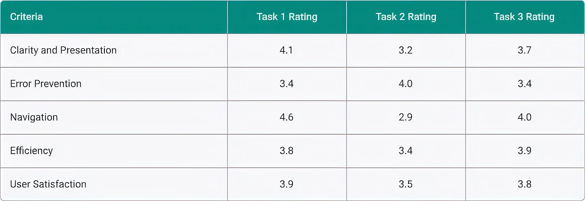
Scatter Diagram — Criteria Evaluation
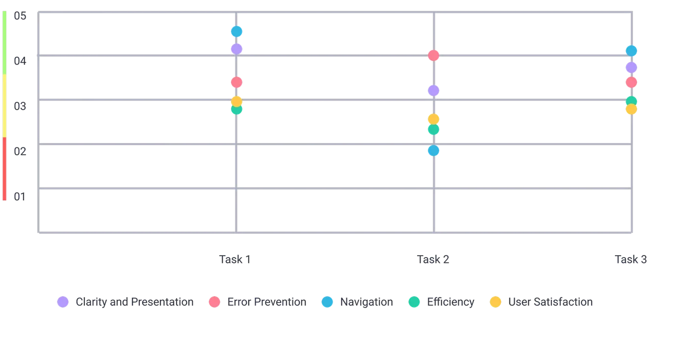
Strengths and Weaknesses
- This is really quick and helps me interpret all crucial information required as a production supervisor
- This is very cool and is a huge improvement from the existing feature
- The visualizations are helping me quickly understand the production breakup
- The data is all there but it takes a while to find it, I really have to work for it
- Just tell me the issue and the solution, I don't want to interpret
- Finding asset level data is not intuitive in the flow, which is needed to find the culprit
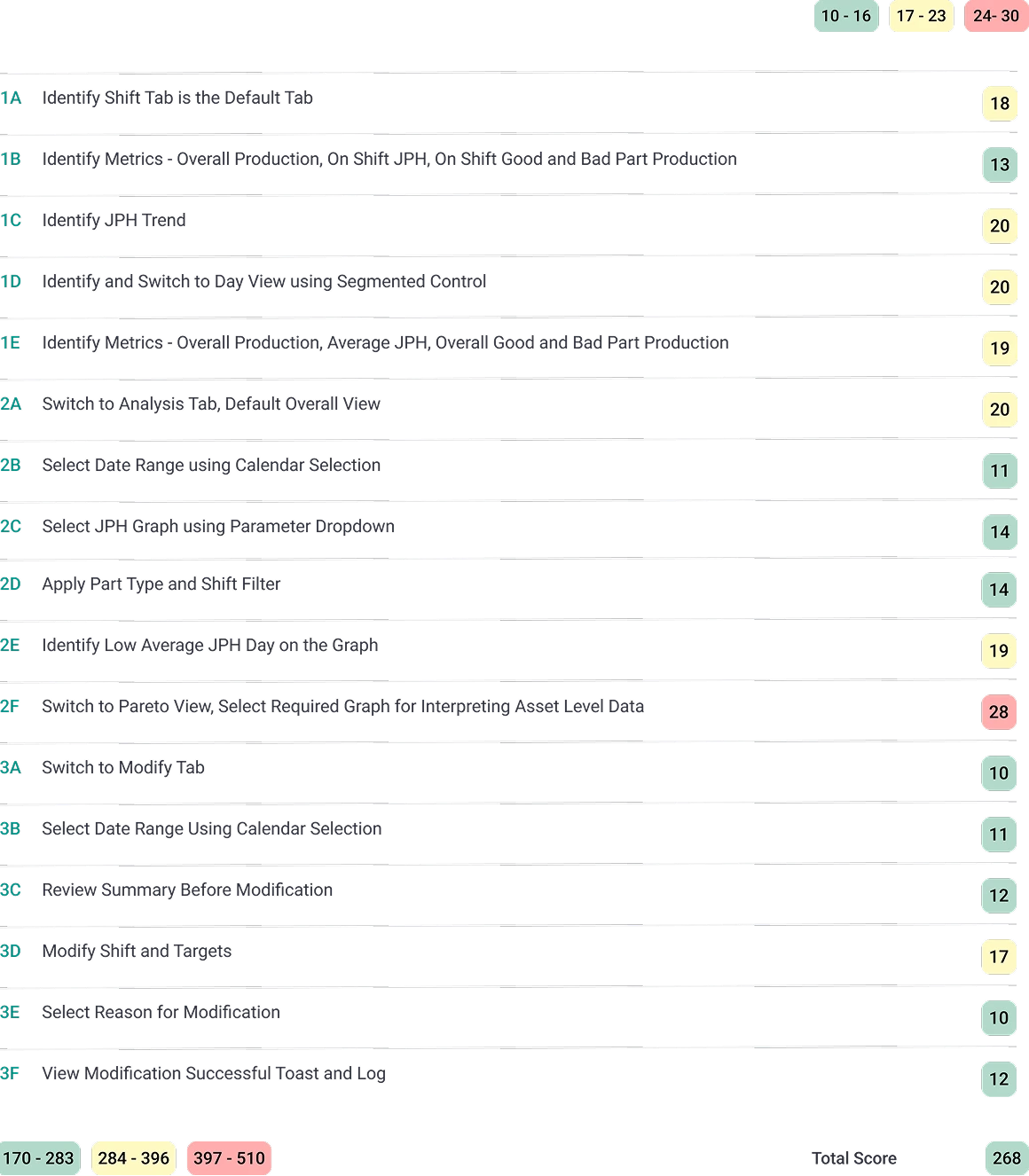
Rating Analysis — PURE Evaluation
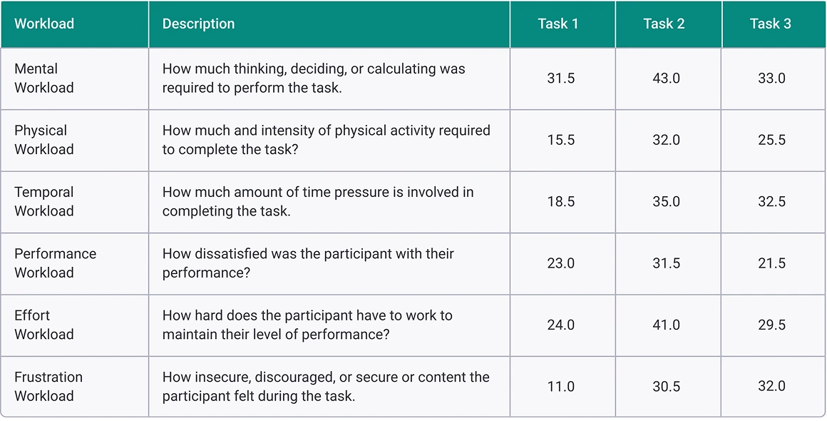
Rating Analysis — NASA Task Load Index (TLX)
Scatter Diagram — NASA Task Load Index (TLX)
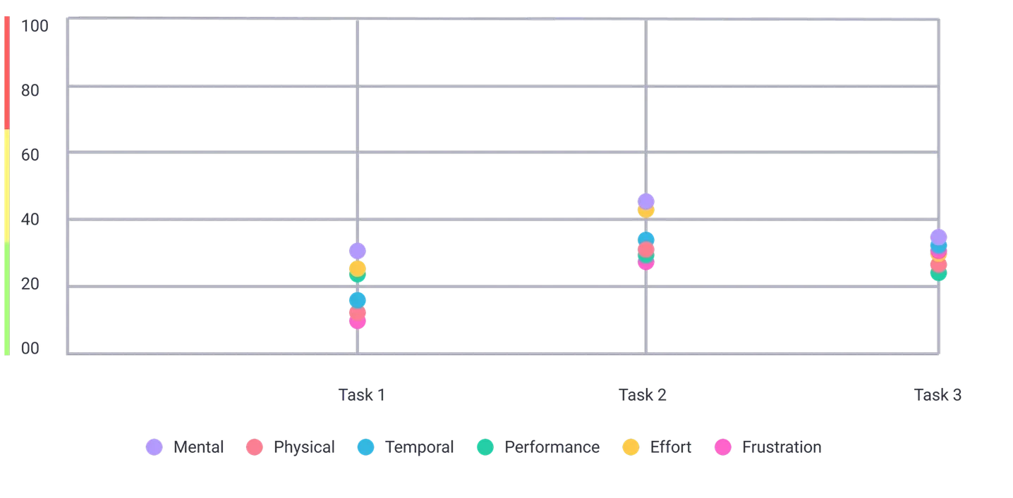
Key Insights and Way Forward
- Ensure that the navigation between different sections of the application is intuitive and clearly indicated. Provide clear labels and indications of where users can find relevant information.
- Increase the clarity of graphical representations by improving the visibility of data labels and making them available without needing to hover over data points.
- Consider using color-coded visuals to indicate trends or changes in data.
- Develop the insights section further to provide detailed analysis and recommendations based on user selections. This can include suggestions on which parts or shifts need further analysis and why, as well as insights on production trends and potential areas for improvement.
- Provide clear summaries before finalizing modifications to help users make informed decisions, and allow bulk modifications. Implement detailed toast messages and modification logs to provide users with clear feedback on modifications.
- Factor in edge cases such as overlapping time across shifts after modifications and ensure that the design accommodates these scenarios effectively. Provide clear indications of modifications made in other shifts to avoid confusion.
- Consider integrating with ERP systems or incorporating resource allocation features to provide users with a true reference of available resources. This will help streamline planning processes and reduce the need for manual calculations.
- Provide clear instructions and guidance throughout the application to help users navigate and understand complex features. This can include tooltips, onboarding tutorials, and contextual help options.
Heuristic Evaluation
I conducted a heuristic evaluation of a production monitoring system with four usability experts. We began by defining the evaluation objectives and selecting Nielsen's heuristics. After aggregating their findings, we held a debriefing session to discuss and prioritize the issues.
- Visibility of System Status
- Match Between System & the Real World
- User Control & Freedom
- Consistency & Standards
- Error Prevention
- Recognition Rather than Recall
- Flexibility & Efficiency of Use
- Aesthetic & Minimalist Design
- Help Users Recognize, Diagnose & Recover from Errors
- Help & Documentation






- Incorporate prominent timestamps to indicate the last data update, ensuring users have latest information.
- Offer detailed error messages that not only pinpoint issues but also provide steps for resolution.
- Implement clear and easily identifiable emergency exits to allow users to swiftly navigate out of undesired states or functions. Consistently placing these exits and visual elements across the interface aids in intuitive navigation.
- Enhance readability by employing larger font sizes and incorporating visual cues such as color contrast or icons to guide users' attention to important information or actions within the interface.
- Utilize tooltips or brief explanations to clarify complex terminology, helping users understand system functionalities without confusion or ambiguity.
- Expand user support resources: Broaden help resources with interactive tutorials and contextual tooltips, assisting users in navigating complex features or functionalities. These additional resources serve to empower users and enhance their overall experience with the system.
Revised and Improved Designs
Post evaluations and feedback rounds, I revised a few elements in the design.
Future Scope
- Utilize AI to provide deeper insights and recommendations based on historical data and real-time inputs. Develop advanced analytics and RCA capabilities.
- Implement Role-Based Access Control (RBAC) to refine and assign tasks tailored to various personas while include functionalities such as operator management and performance tracking.
- Develop mobile view for stakeholders to access and interact on-the-go.
- Track and optimize energy consumption to contribute to sustainability goals.
- Deepen ERP, SCM integration and expose APIs to extend the module to include production planning.