
AI-Powered Analysis for Faster Decisions in Manufacturing
An Industrial AI platform that simplifies shop floor intelligence with natural language queries, KPI analysis, and automated reports thus helping teams act faster and boost efficiency.
Do the right analysis instantly
Ask a question. Get an answer — not a dashboard to hunt through.
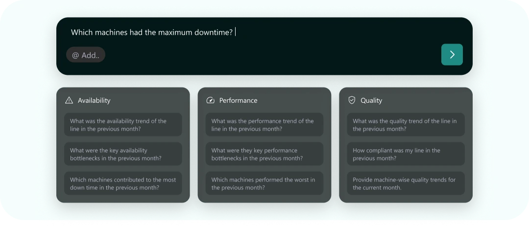
Which machines had the maximum downtime?
Availability
- What was the availability trend of the line in the previous month?
- What were the key availability bottlenecks in the previous month?
- Which machines contributed to the most down time in the previous month?
Performance
- What was the performance trend of the line in the previous month?
- What were they key performance bottlenecks in the previous month?
- Which machines performed the worst in the previous month?
Quality
- What was the quality trend of the line in the previous month?
- How compliant was my line in the previous month?
- Provide machine-wise quality trends for the current month.
The Challenge
Not everyone is a Data Analyst.
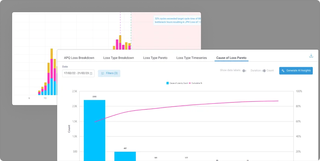
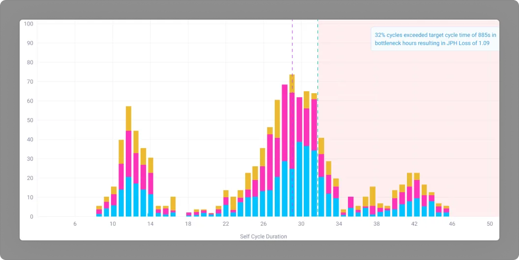
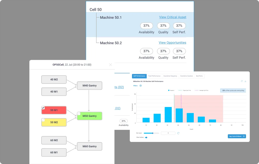
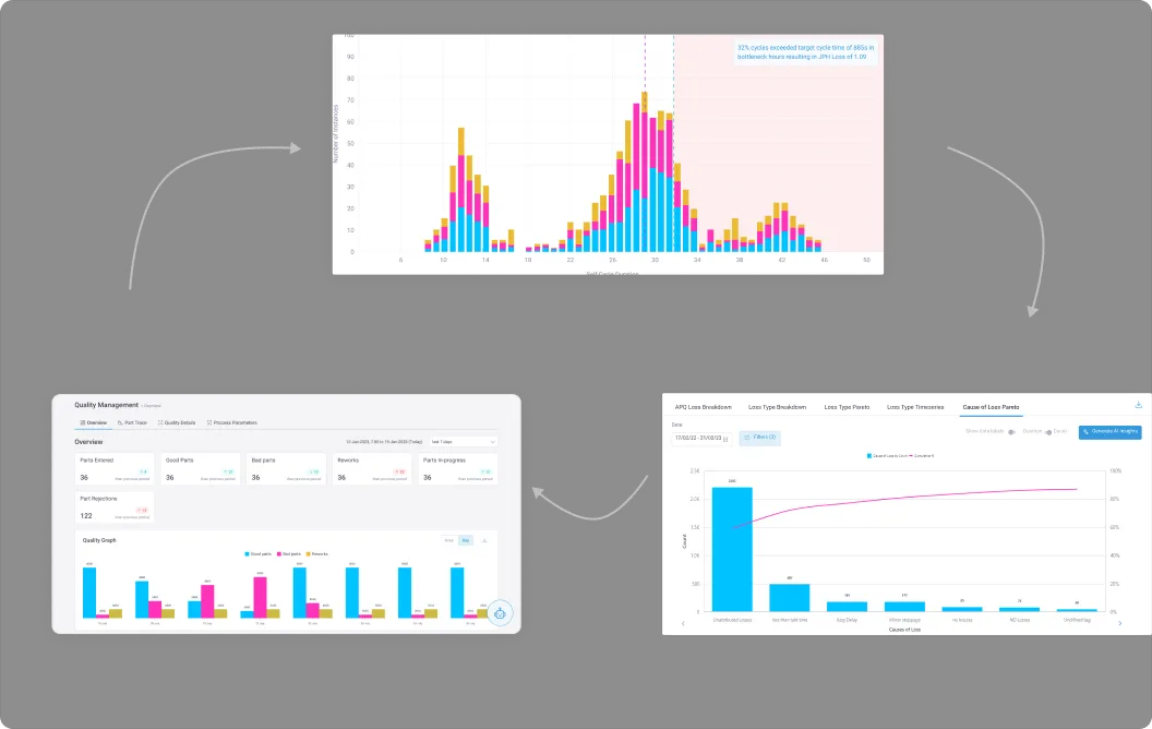
Manufacturing teams waste hours navigating complex dashboards to find simple answers about their production data
Plant managers, maintenance technicians, and quality engineers spend an average of 20 minutes per query navigating through complex dashboards, multiple screens, and dense reports to find critical manufacturing insights, hence delaying the identification and resolution of issues.
Complexity Overload
5+ clicks to access basic performance metrics
Steep Learning Curve
At least 2-3 weeks training required for new users
Delayed Decisions
Slow data analysis and access leads to production bottlenecks
No Mobile Access
Supervisors couldn't access shopfloor data on-the-go
Research
We didn't start from zero.
That 20-minutes-per-query gap wasn't a blank slate to solve from scratch. Rishi is a conversational layer over Ikshana, our existing manufacturing dashboard — the product these plants already used, and the database Rishi still runs on.
We'd tried to solve this before: AI analysis, automated insights, custom reports. None of those experiments went anywhere. It was the rise of general-purpose LLMs that first made a conversational answer to "what's wrong with my line" look buildable.
One question, every role
Ten interviews with existing Ikshana customers. The recurring complaint wasn't about navigation. Every role was really asking one question: what's wrong with my line so I can fix it?
The delay was the damage
Shadowing our CS team put a cost on the gap: ~20 minutes per query was typical, and by the time an issue was traced, the loss had already happened. The delay wasn't inconvenient — it was the damage.
Presets came from the interviews
Role-based preset queries came from these interviews. We knew which questions each role asks because we asked them.
One piece of feedback cut across every one of those interviews: customers wanted direct answers to their line's questions, not another interface to learn.
What needs my immediate attention?
Maintenance Engineer
Don't make me navigate through 4-5 steps to get an answer.
Line Supervisor
Just directly tell me where's the problem.
Line Head
How am I supposed to read this graph & what is it trying to tell me?
Maintenance Engineer
Not “make the dashboard easier to read.” Make the question answerable before it costs anything.
Solution
RISHI — Industrial Agentic AI Platform
RISHI is an Industrial AI platform designed to simplify shop floor analysis by enabling manufacturing teams to ask questions in natural language and receive instant, contextual insights. By combining personalized landing experiences, smart suggestions, and AI-powered visualizations, RISHI eliminates complex dashboard navigation and steep learning curves. The platform supports KPI analysis, trend monitoring, interactive data exploration, and one-click automated reports thus making production data accessible, actionable, and usable by everyone on the shop floor, not just data analysts.
Key Features
- Natural Language Queries
- Context Aware Suggestions
- Intelligent Visualisations
- AI-Powered Reports
- Interactive Data Tables
Problem 01
Constant Context Change
An average expert user handling multiple lines faces context changing as their role and the issues faced in each line might be different.
Feature 01
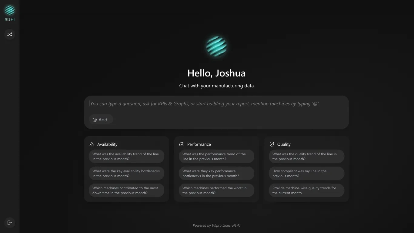
Personalized Landing Experience with Preset Queries
- What it is
- Context-aware greeting with plant and line information displayed immediately upon login. Preset queries catered to the user's role.
- What it does
- Shows user name, current plant location, and preset persona specific queries related to current line at a quick glance
- Why it matters
- Reduces cognitive load by providing line context. Persona specific preset queries provide a head-start to users.
Rejected along the way

Placeholder Text
- Always there and not interrupting
- Doesn't tell you how to prompt for it
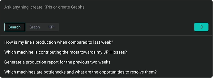
Suggestion Prompts with Task-Specific Tabs
- Informs user about "how to prompt"
- Categorized suggestions
- Prompts only shown once the user clicks the input field and picks a category
- Categorizing by use case broke down — e.g. a graph and a KPI could be asked in a single prompt
Problem 02
Steep Learning Curve and Complexity Overload
5+ clicks to access basic performance metrics. 2-3 weeks training required for new users
Feature 02
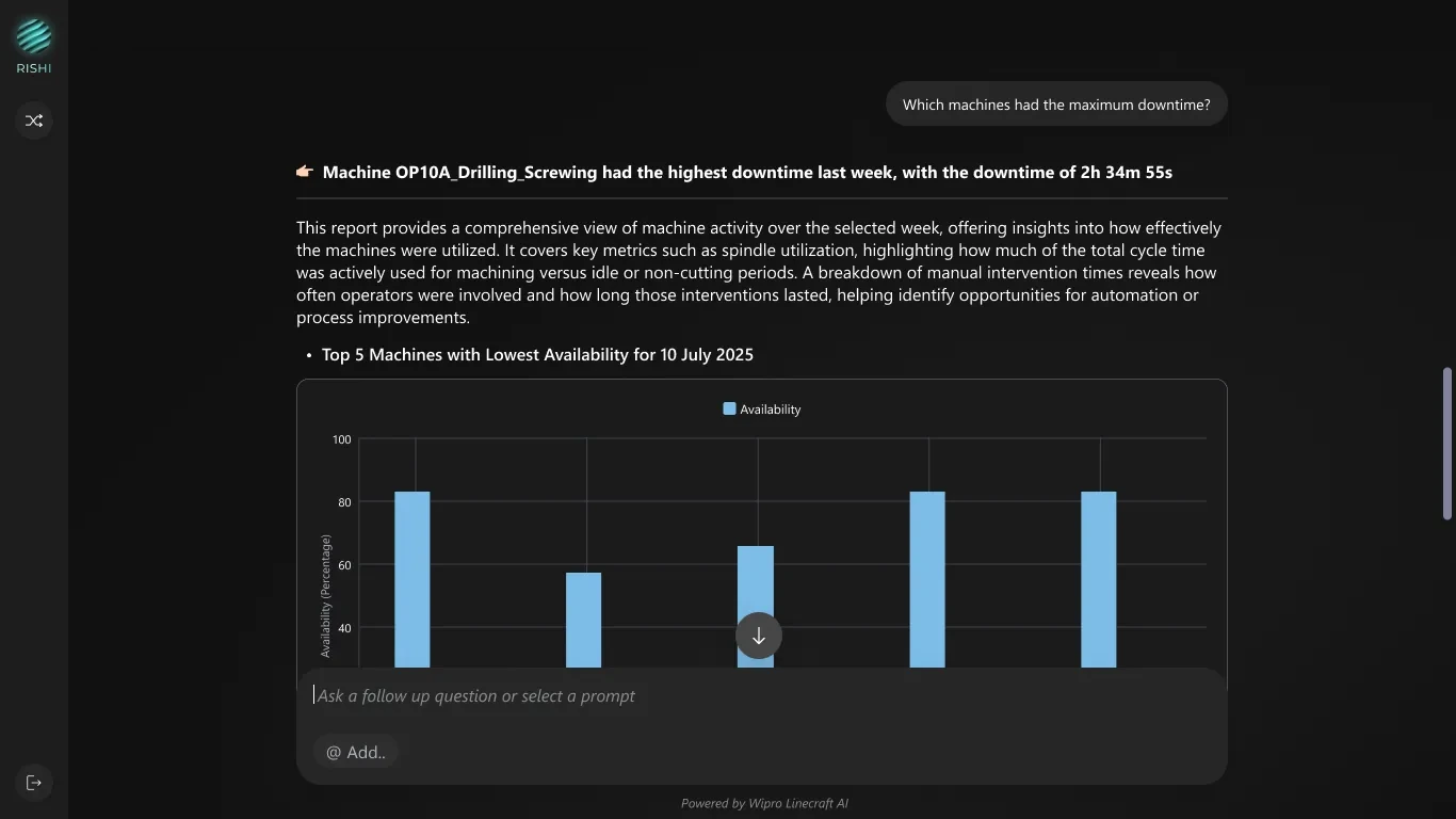
Natural Language Query Input
- What it is
- Large, prominent text input that accepts questions in plain English, no query syntax needed - allowing anyone and everyone to use the feature.
- What it does
- Processes natural language questions like "Which machines had the maximum downtime?" and returns relevant data almost instantly
- Why it matters
- Eliminates training requirements - anyone can query production data without learning complex dashboard navigation and confusion.
Problem 03
Ambiguity and Inefficiency in Entity Referencing
Users struggle to quickly and accurately reference specific machines or entities because typing full names is time-consuming, prone to errors, and difficult when exact names are not recalled, causing ambiguity and reducing efficiency.
Feature 03
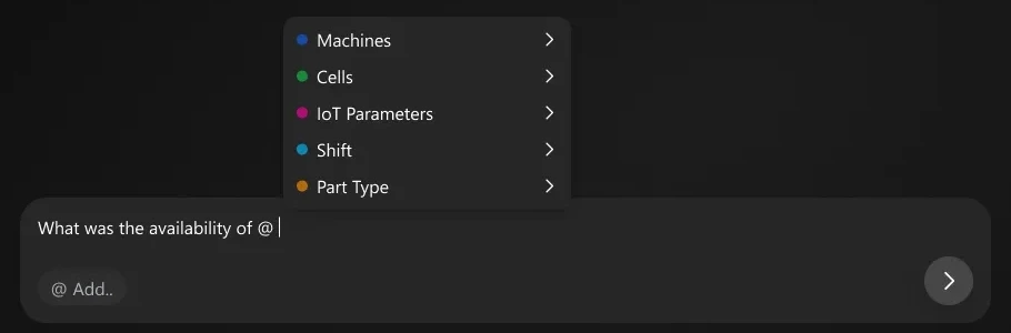
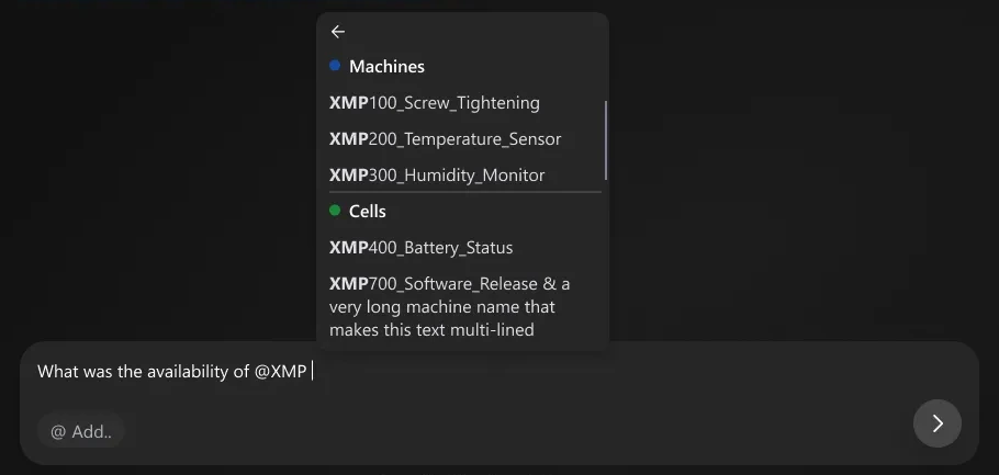
@ Mention Tagging
- What it is
- Type "@" to reference specific entities such as machines, IoT parameters, shifts, part types with color-coded tags
- What it does
- Provides autocomplete for all referenceable entities; creates visual tags that clarify query scope
- Why it matters
- Reduces ambiguity in complex queries, "@Machine_10A" vs. "that first machine"

Problem 04
Difficulty Visualizing Trend and Comprehending Bulk Data
To find one answer user has to jump through heaps of data across screens & then try to understand what that data means.
Feature 04
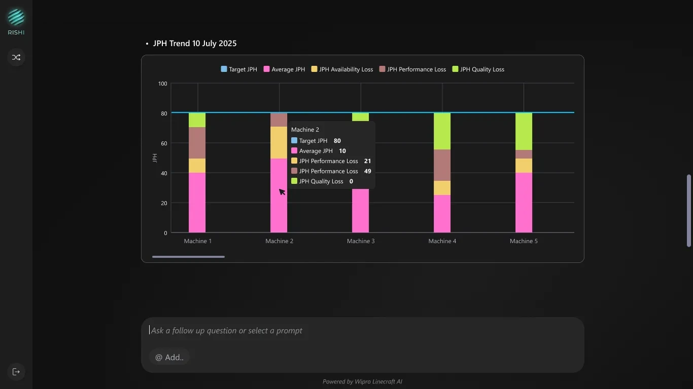
Intelligent Data Visualizations
- What it is
- AI-generated charts and tables that automatically format into bar charts, trend lines, data tables based on query type
- What it does
- Transforms raw manufacturing data into visual insights: JPH trends, availability comparisons, downtime analysis
- Why it matters
- Users get an interpretable shape for their answer instantly, without ever deciding how to chart it themselves
Problem 05
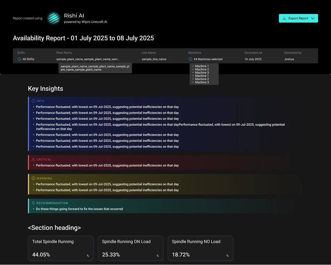
Manual Report Generation
The process of compiling data for reports to share with management is time-consuming, as it involves collecting information from various sources and extracting meaningful insights.
Feature 05
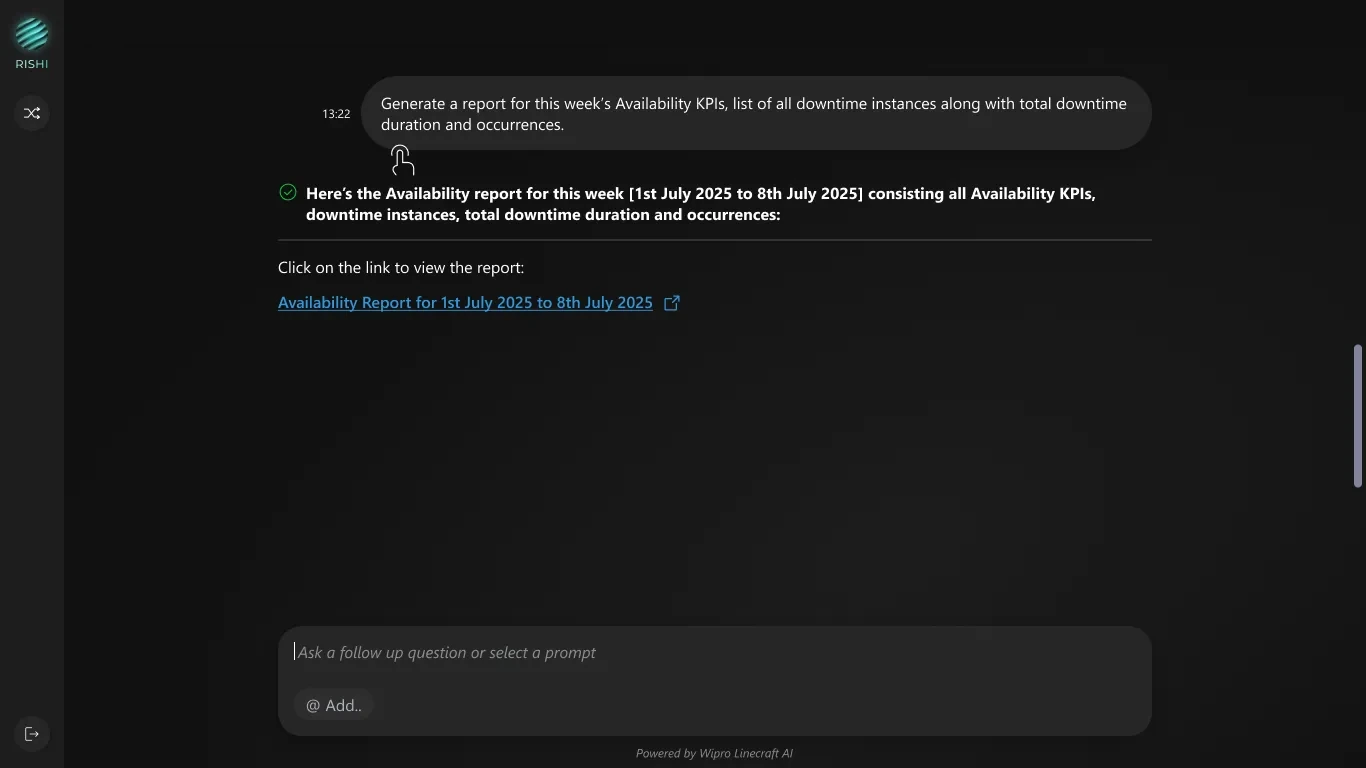
One-Click PDF Reports
- What it is
- Instantly generated comprehensive reports with AI-written insights, charts, and data tables
- What it does
- Converts conversational query into formatted PDF with executive summary, key insights and relevant supporting data
- Why it matters
- Eliminates manual report creation so managers can share insights with stakeholders immediately
Problem 06
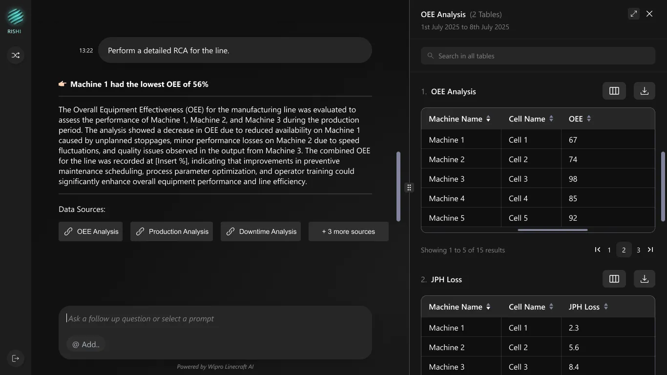
Unsortable LLM Generated Tables
LLM generated tables are often presented as static outputs, limiting users' ability to sort, filter, or search data. As a result, users must manually scan long lists to interpret information, increasing cognitive load and time spent on decision-making — especially when dealing with large or complex datasets.
Feature 06
Side Panel Experience for Full Data Interaction
- What it is
- A contextual side panel that opens on data source selection, showing the full dataset in an interactive format.
- What it does
- Turns static LLM generated tables into sortable, searchable, and exportable data without breaking context.
- Why it matters
- Reduces cognitive load and interpretation time, helping users quickly analyze data and take action.
Problem 07
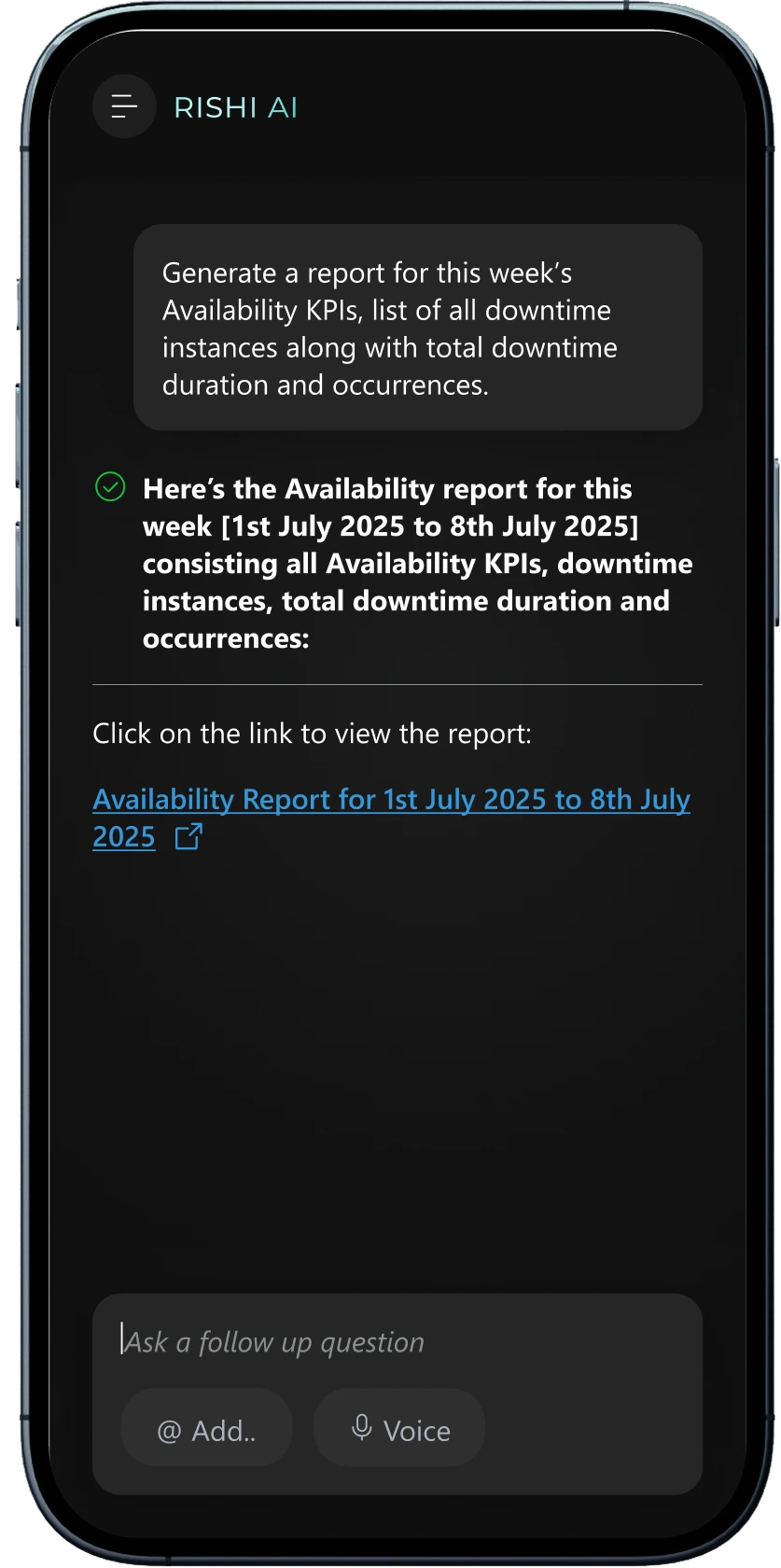
No Mobile Access
Supervisors and technicians are rarely at a desk — they're on the shop floor, moving between machines, across shifts, and often more comfortable speaking a language other than English. A desktop-only, English-only tool couldn't reach them where the work actually happens.
Feature 07
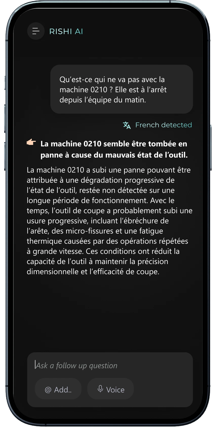
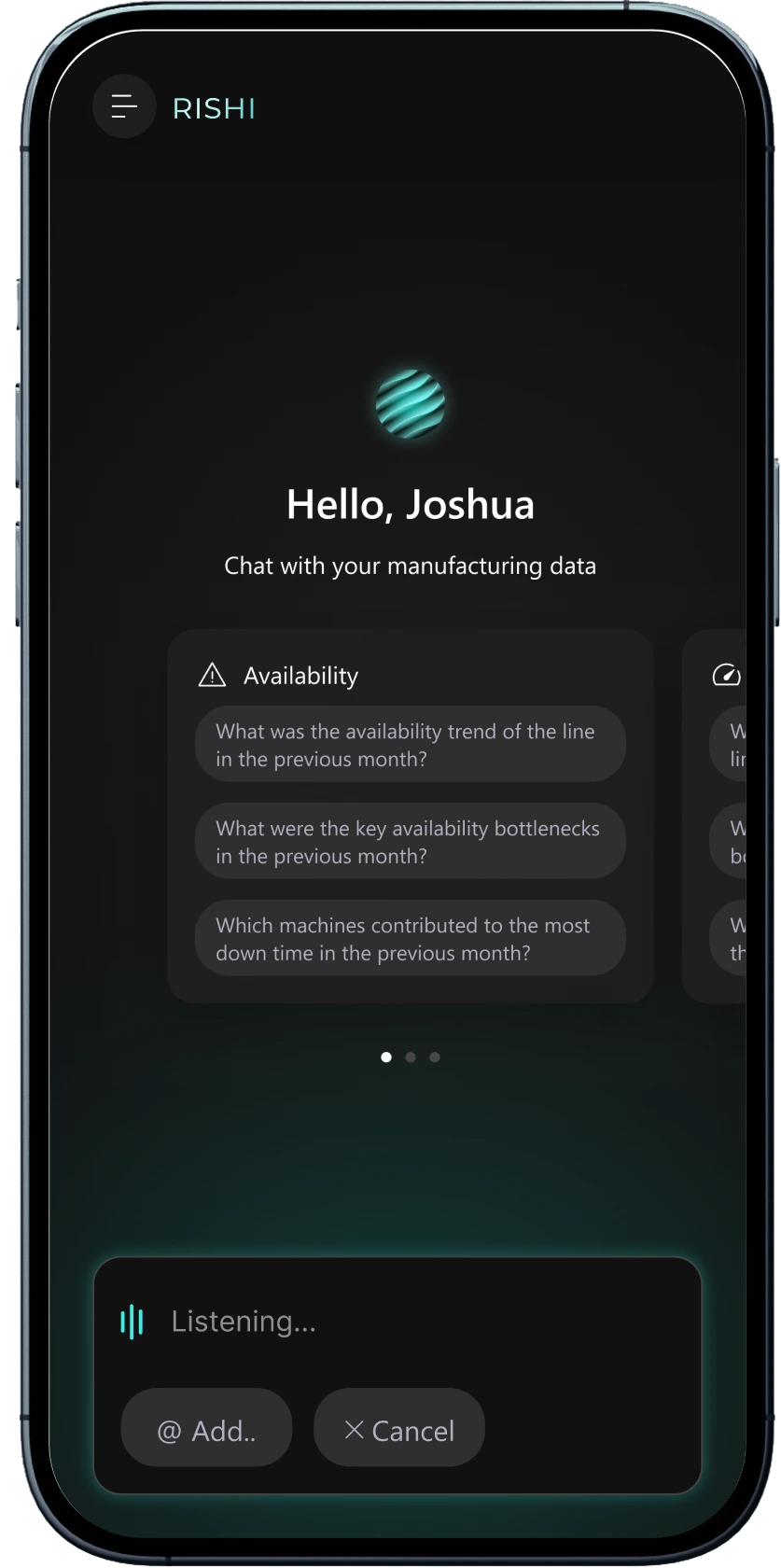
Mobile Access, Multilingual Conversations & Voice
- What it is
- A fully responsive mobile experience that understands and replies in multiple languages, plus a voice mode so a question can be spoken instead of typed.
- What it does
- Detects the language a question is asked in (French, for instance) and answers in kind; tapping Voice starts listening and transcribes the spoken question straight into the query box.
- Why it matters
- Puts the same shop-floor answers in the hands of technicians and supervisors wherever they are, in whichever language suits them in the moment — typed or spoken. Voice still starts with a tap, but replaces typing with speaking once activated, cutting down on keystrokes when hands are gloved or occupied with tools. The voice button and other primary mobile controls are sized at 44px for reliable tapping in those conditions.
Reflection
When the constraint moved
The first version ran on a hosted external model: fast to build with, but it meant shop-floor data leaving the customer's own systems. For plants with strict data-privacy requirements, that wasn't workable.
We moved to a self-hosted model running inside the customer's own environment, so their data never left their infrastructure. Speed was part of the reason too: response times dropped from up to 2 minutes down to a few seconds.
The status panel (thinking, pulling data, generating report) still runs underneath, and stays visible after the fact: users can expand it to see the tools Rishi called and the steps it took to get there. But at 90 seconds that sequence needed to reassure in real time; at a few seconds it needed to get out of the way. So we layered streaming on top: the answer starts appearing as soon as it's ready, while the full reasoning trail stays one click away.
The bigger lesson wasn't just about speed. It was that in this domain, privacy and performance had to be solved together, and the same interface element had to work both as a live status update and as a permanent, inspectable record.
Reflection
When Rishi is wrong
A wrong answer here isn't a bad search result. If Rishi confidently names the wrong machine, a technician walks to the wrong end of the plant while the line keeps losing output.
Asks instead of guessing
The most common ambiguity was time — “last month,” “recently,” no range specified. Rishi asks rather than assuming, because a guess produces an answer that looks authoritative and isn't.
Shows its work
Every response carries the time range used and a table of the source data it drew from. Users don't have to trust the answer — they can check it.
Says when it doesn't know
Missing or unavailable data returns an explicit empty state, not a plausible-looking approximation.
Can be redirected
A wrong chart type is corrected in the next turn. Correction stays inside the conversation instead of forcing a restart.
Narrates waiting
See “When the constraint moved” — Rishi tells the user what it's doing while it works, rather than leaving the wait unexplained.
The failure we caught in internal testing wasn't in any of these behaviours. Different users were getting different answers to the same question, because the underlying formulas weren't consistent. We standardised them before launch. In this domain the interface can be perfect and still be wrong. Trust lives in the calculation, not the chat bubble.
Roadmap
What's next
Three things are already in motion, not a wish list.
Insights
Rishi asking, not just answering. Root cause analysis starts when a user asks for it. The next step is Rishi noticing something worth investigating on its own — a shift dropping, a KPI drifting — and surfacing it before anyone has to go looking.
Follow-up
One answer opening the next question. A single answer often raises three more: was this machine always the worst performer, is this pattern recurring, how does it compare to last month. The next step is Rishi surfacing those on its own, so one query becomes a line of inquiry instead of a dead end.
RAG (Retrieval-Augmented Generation)
Diagnosis meeting the fix. Manual and SOP retrieval already exists as its own capability elsewhere in the platform. Merging it into Rishi means what's wrong and what to do about it end up in the same conversation, not two separate tools.
None of this changes what Rishi already does. All of it changes what happens right after.
Impact
Measurable Impact
Results after 1 month of deployment
Faster Problem Identification
20 min → 2 min average
Estimated — from CS shadowing pre-launch, user reports post-launch.
User Satisfaction Score
Up from 68% baseline
Informal SUS, n=20, before and after.
Reduction in Training Time
3 weeks → 30 minutes
Observed onboarding session length, replacing prior structured training.
Reduction in CS Team Support
Manual Reporting → AI Analysis
Ticket volume and CS reports, one month, 3 enterprise customers.
Before: Traditional Dashboard
- 20-minute average query timeUsers navigated 5+ screens to find simple metrics
- 2-3 weeks training requiredNew users needed extensive onboarding sessions
- 42% adoption rateMany workers avoided the system entirely
- Desktop-only accessFactory floor supervisors couldn't access data
- Manual report creationAnalysts spent hours or days building weekly reports
After: Conversational AI Interface
- 2-minute average query timeNatural language query → instant results
- 30-minute training sessionUsers productive on day one
- 95% adoption rateCross-functional teams actively using daily
- Mobile responsive designQuick queries happen on phones
- One-click PDF reportsAI generates comprehensive reports in less than 1 minute
Use cases
Powerful Capabilities, Simplified
Unlocking powerful insights through simple questions, automated reports, and ready-made analytics designed for real-world manufacturing teams
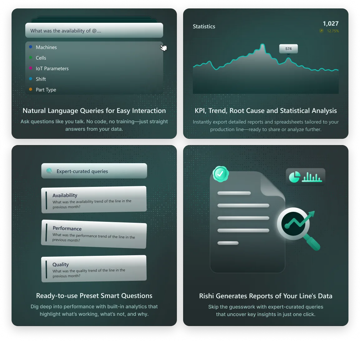
Natural Language Queries for Easy Interaction
Ask questions like you talk. No code, no training — just straight answers from your data.
KPI, Trend, Root Cause and Statistical Analysis
Dig deep into performance with built-in analytics that highlight what's working, what's not, and why.
Ready-to-use Preset Smart Questions
Skip the guesswork with expert-curated queries that uncover key insights in just one click.
Rishi Generates Reports of Your Line's Data
Instantly export detailed reports and spreadsheets tailored to your production line — ready to share or analyze further.
Key learnings
Key learnings
Insights from one quarter of design, development, and deployment
Conversational UI reduces cognitive load dramatically
Users with 15+ years of manufacturing experience adapted to the chat interface faster than traditional dashboards. The familiar messaging pattern eliminated learning curves as everyone already knows what to ask. We saw 95% task completion rates in first-time user testing.
Progressive disclosure beats feature overload
We initially planned all advanced features upfront, however during testing we noticed that the users were overwhelmed. By starting with simple natural language input and revealing advanced features (filters, @mentions, table functions) only after the first version, we increased engagement. Let users discover complexity at their own pace.
Context is everything in manufacturing
Displaying plant, line, and user information at all times wasn't just a nice-to-have — it was critical. Manufacturing data without context is meaningless. When we removed the persistent header in early testing, users felt "lost" and made query errors.
Mobile support is mandatory for factory floors
Many quick queries happen on mobile devices. Factory supervisors are rarely at desks as they're troubleshooting machines, inspecting production lines, attending shift handovers. Designing for mobile ensured the interface worked and supports resolution where manufacturing actually happens.
Dark theme isn't just aesthetic, it's functional
Manufacturing facilities have challenging lighting: bright overhead LEDs, machine displays, sunlight through high windows. Dark interfaces reduced eye strain complaints. Color choice matters in industrial environments.